You are using an out of date browser. It may not display this or other websites correctly.
You should upgrade or use an alternative browser.
You should upgrade or use an alternative browser.
Suggestion for empty black box in collect action screen
- Thread starter Adam
- Start date
One more idea, I really like the white box's but 8 box's isn't enough for all the info I like to see. It looks like 4 more box's could fit along the bottom without any trouble. More box's please.
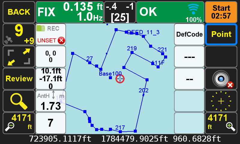
I have a suggestion to populate the empty black box in the collect action screen with the review option. I use review a lot and this would also free up a white box for something else.
This black box will not be empty for line, curve, trajectory.
One more idea, I really like the white box's but 8 box's isn't enough for all the info I like to see. It looks like 4 more box's could fit along the bottom without any trouble. More box's please.
We can fill the whole Action Screen with boxes if you don't want to see points after collections and see them only in Review.
This black box will not be empty for line, curve, trajectory.
Okay, would it be possible to add a few more white box's along the bottom?
I got another, I am filling up my favorite codes but 25 isn't enough. There is a lot of room left in each box, as most of my codes are at the most 3 letters. Making the box's half the size could double the amount of favorite codes that can be recalled quickly.
This question is very important for us: What should be the size of to the Codes and Tags boxes. Is it true that all use at most 3 letters for codes?
We can fill the whole Action Screen with boxes if you don't want to see points after collections and see them only in Review.
I think a few along the bottom would be okay and I would still be able to see enough of the map, then if I need to see more I could go to review.
This question is very important for us: What should be the size of to the Codes and Tags boxes. Is it true that all use at most 3 letters for codes?
95percent of mine are less than 3 letters. The longer codes don't get used much and I could go hunt for them in the reservoir when needed.
This question is very important for us: What should be the size of to the Codes and Tags boxes. Is it true that all use at most 3 letters for codes?
I have a lot of codes that are longer, since we already have the current layout maybe just make an option for a screen that has double the boxes.
That would be a good thing for the additional white boxs too, to be able to toggle them or maybe they could be faded a little more so the screen is fully visible underneath them when not used!I have a lot of codes that are longer, since we already have the current layout maybe just make an option for a screen that has double the boxes.
An additional row of boxes (4 more boxes) had been added to the action screens. The Review and Photo Record buttons were added in the new black boxes:

We put Review and Photo Record buttons permanently on the black boxes and removed from the white box list. We seek suggestions as which two buttons should be put in white boxes permanently. Is that true that "Review" and "Photo Record" are two that are everybody's most favorite? We did not Point Name there, because only white boxes will appear on the expanded version of the Action screen.
We put Review and Photo Record buttons permanently on the black boxes and removed from the white box list. We seek suggestions as which two buttons should be put in white boxes permanently. Is that true that "Review" and "Photo Record" are two that are everybody's most favorite? We did not Point Name there, because only white boxes will appear on the expanded version of the Action screen.
One option is to move Antenna Height to the black box, if everyone agrees that it is the item that always want to see.
One option is to move Antenna Height to the black box, if everyone agrees that it is the item that always want to see.
Antenna Height would be great.
I like that idea too. Antenna height as black box.
"DSNR" will be added as an option for the white boxes. It is the "Delta Signal to Noise Ratio" which is the interference to satellite signals and its degradation due to transmitters around you (airports, naval stations, radio and TV stations, etc). Numbers higher than 6 are significant.
Four numbers show interferences in GPS L1/L2 and GLONASS L1/L2.
This is the same DSNR that you can assign to the U1-U4 buttons too.
Four numbers show interferences in GPS L1/L2 and GLONASS L1/L2.
This is the same DSNR that you can assign to the U1-U4 buttons too.
